
Guest Post from Michael Essek: Simple Text Switcheroo

Here at TeePublic, we've been fans of Michael Essek's Print-on-Demand tips for a while, so we're pumped to be running another entry in conjunction with him today. (Be sure to check out his previous blog entries on TeePublic’s blog here!) Like what you see? There's more where that came from on his website, so do check it out! With no further ado...take it away, Michael!
---
The Simple Text Switcheroo
This is a T-Shirt idea technique that's really simple - and doesn't require detailed graphics or illustrations. I'm calling it The Simple Text Switcheroo.
The Simple Text Switcheroo takes a simple phrase or saying and renders it in an unexpected style. Here are some examples:
- "Merry Christmas" in a heavy-metal-font-style:
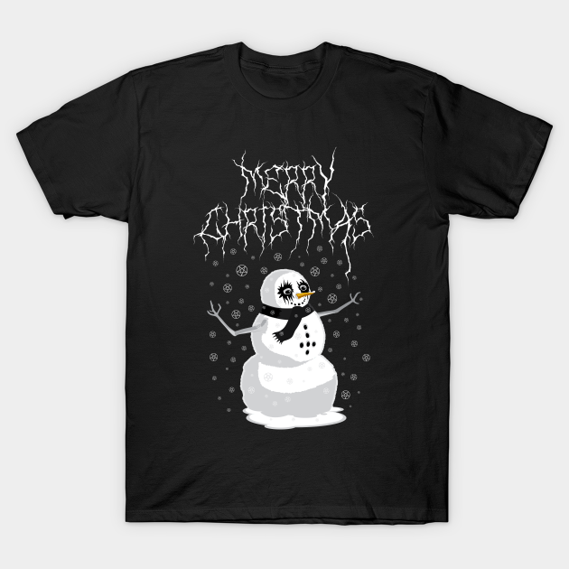
[Metal Snowman by thisboysart]
- or "Death Metal" in a cutesy-rainbows-and-clouds style:
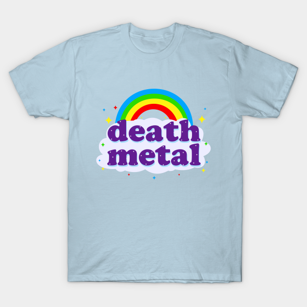
[Death Metal by MoustacheRoboto]
What do these designs have in common?
They work because of the juxtaposition between the "message" (the text) and the "delivery" (the style).
The message carries one meaning - but the style in which it is delivered carries a very different meaning. Hence a conflict - a contrast - and therefore (hopefully) - humor!
As you can see from the examples above - this approach can work with the very shortest and simplest of phrases - so you don't need to be some master joke writer to use it.
You just need to have a decent "contrast" between a given message and a given style.
Let's walk through exactly how you can use this method. First you need a phrase, a saying or a greeting. This is your "message" part, which will contrast with our "delivery" (style).
Ideal examples to use as your text for this method for include things like:
- Popular slogans ("Save the Whales", "Eat the Rich")
- Greetings ("Merry Christmas", "Happy Hanukkah")
- Categories, topics, subjects or hobbies that have strong visual associations (death metal, cross stitching, skateboarding)
- Slang terms or text-based memes ("Ok boomer'", "Yeet", "Poggers")
The most important thing is that your text carries a certain meaning or association that is obvious to the customer or reader. Sayings or phrases that instantly evoke visual associations (like Merry Christmas, Death Metal) are likely to yield the strongest design concepts.
Once you have some text that you think fits the bill - your job is to find a visual style that is suitably different from the message itself (and thus creates a juxtaposition). A good place to start is to identify the "opposites" of some of the standard associations of your phrase.
For example:
- The text "Merry Christmas" would be associated with feelings like: warmth, safety, family, wholesomeness, goodwill, etc.
- And the opposite of those feelings might be stuff like: danger, depression, anger, anti-authority, etc.
- Then we need to see if we can find a visual style that evokes a sense of danger, anger, anti-authority, etc.
- An example of a style that fits those feelings would be the "Death Metal" style.
Which is why the "Heavy Metal Merry Christmas" example from earlier works!
Let's do a few more examples:
- "Save The Bees" - a well established environmentally-friendly message, which would usually be associated with floral, outdoorsy-type graphics.
- What would the "opposite" of such a style be?
- Well - a typical "Save The Bees" Shirt would be quite "organic" - evoking nature, the great outdoors, etc.
- So we could look for a man-made, artificial, cold or tech-like style.
Something like the "80's retro style":
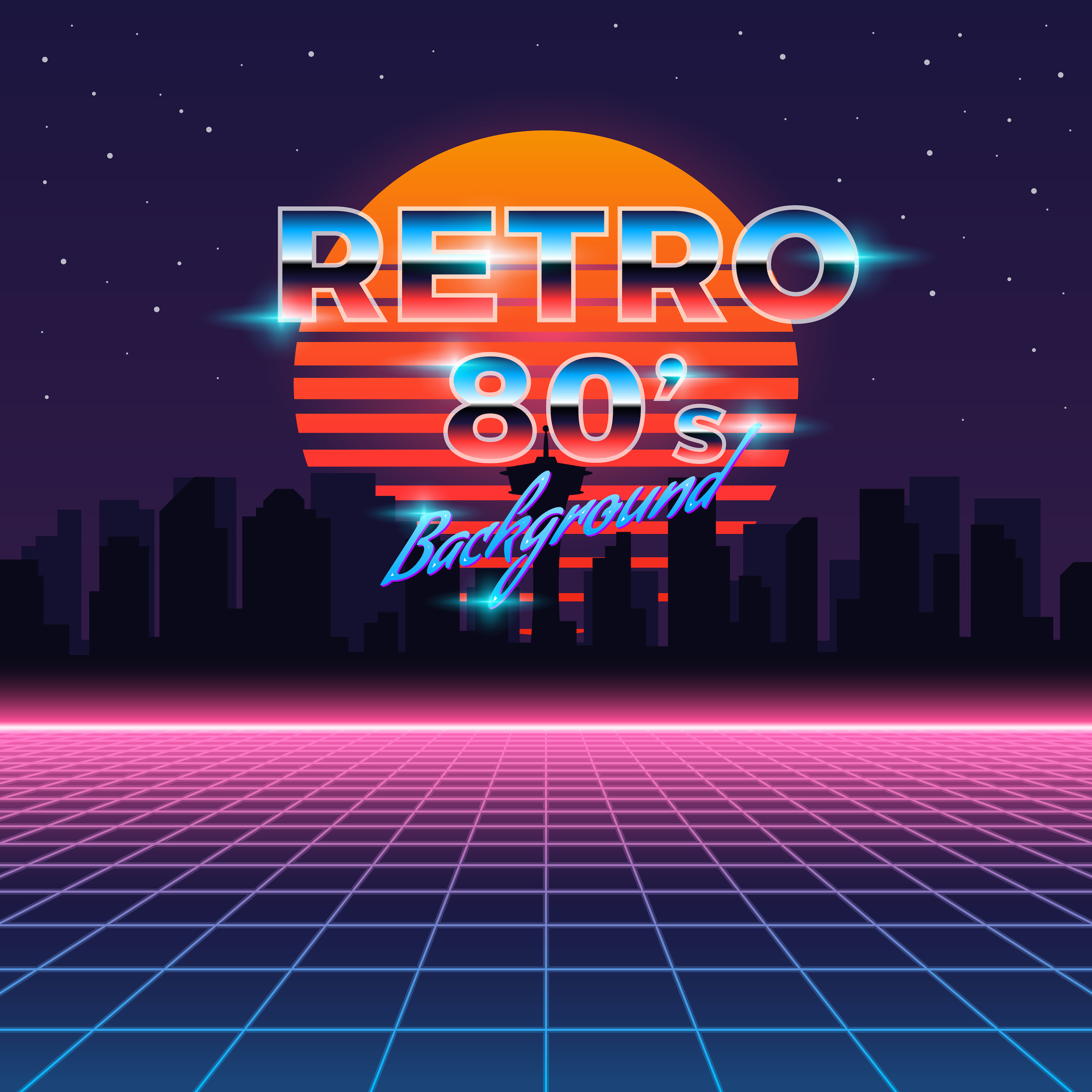
[via Freepik]
So a retro 80s "Save The Bees" design may indeed work - because there's a sufficient contrast between the message and style - plus the '80s' style translates so well to a T-Shirt (you just need the right font, right colours and a couple of simple graphic elements).
Another example:
- "Life Is Meaningless" - a serious, depressive, nihilistic message.
- What would work well here is something cutesy / flippant - like rainbows and unicorns, or a cross stitch style.
Something like this:
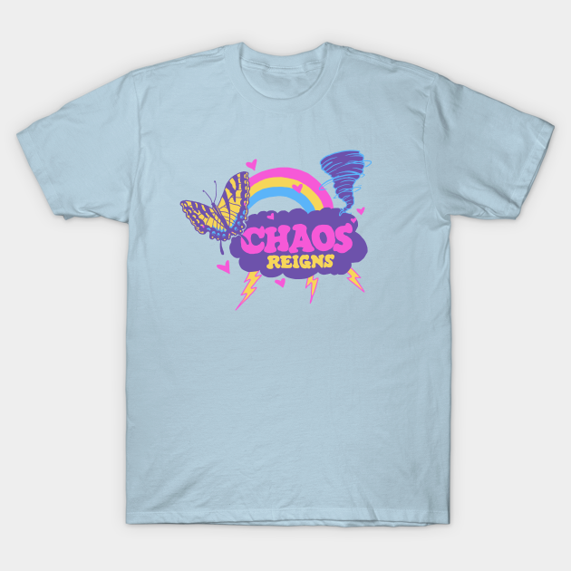
Combine that message with that style - and you have the makings of a funny idea that resonates - even if you aren't a nihilist or a cross-stitcher.
So there you have it - the old Simple Text Switcheroo method.
Try it out on your favorite messages / slogans / sayings - and you could soon have a bucketful of hilarious design concepts that hit the mark with a broad range of customers.
Until next time,
Michael Essek
Website
Twitter
Facebook

---
Thanks for reading and of course, a big thank you to Michael Essek for sharing his expertise with all of us once again! Michael recently published a new guide to selling on Teepublic, so be sure to check that out!
And be sure to check out Michael’s previous blog entries for TeePublic.
Has this blog entry inspired you to try new things?


